Forecasting patient demand at urgent care clinics using explainable machine learning
2023-12-01TeoSusnjakPaulaMaddigan
Teo Susnjak | Paula Maddigan
School of Mathematical and Computational Sciences,Massey University,Auckland, New Zealand
Abstract Urgent care clinics and emergency departments around the world periodically suffer from extended wait times beyond patient expectations due to surges in patient flows.The delays arising from inadequate staffing levels during these periods have been linked with adverse clinical outcomes.Previous research into forecasting patient flows has mostly used statistical techniques.These studies have also predominately focussed on short-term forecasts, which have limited practicality for the resourcing of medical personnel.This study joins an emerging body of work which seeks to explore the potential of machine learning algorithms to generate accurate forecasts of patient presentations.Our research uses datasets covering 10 years from two large urgent care clinics to develop long-term patient flow forecasts up to one quarter ahead using a range of state-of-the-art algorithms.A distinctive feature of this study is the use of eXplainable Artificial Intelligence(XAI) tools like Shapely and LIME that enable an in-depth analysis of the behaviour of the models,which would otherwise be uninterpretable.These analysis tools enabled us to explore the ability of the models to adapt to the volatility in patient demand during the COVID-19 pandemic lockdowns and to identify the most impactful variables,resulting in valuable insights into their performance.The results showed that a novel combination of advanced univariate models like Prophet as well as gradient boosting, into an ensemble,delivered the most accurate and consistent solutions on average.This approach generated improvements in the range of 16%–30% over the existing in-house methods for estimating the daily patient flows 90 days ahead.
K E Y W O R D S data mining, explainable AI, forecasting, machine learning, patient flow, urgent care clinics
1 | INTRODUCTION
Urgent Care Clinics (UCCs) and Emergency Departments(EDs) provide round-the-clock medical care to patients requiring immediate medical assistance.Both UCCs and EDs are frequently the entry-point to healthcare services for a large segment of patients and are therefore susceptible to periodic overcrowding.Congestion in EDs is particularly problematic since delayed treatment has been linked with numerous negative clinical outcomes[1].However,even at UCCs,insufficient staff availability could lead to overcrowding which may result in acute conditions being overlooked [2].
Hence, it is essential to implement strategies that facilitate efficient human resource allocation and effectively manage patient demand.In this context, accurately forecasting patient demand becomes crucial, particularly for UCCs, which play a vital role in providing timely medical care.By forecasting patient demand, healthcare providers can optimise resource allocation and ensure the smooth functioning of medical services beyond primary care.The crux of this research lies in understanding and addressing the challenges of patient flow forecasting at UCCs where forecasting approaches in this domain encompass the estimation of daily patient arrivals, as well as more detailed predictions on an hourly basis, thus enabling a comprehensive approach to resource planning and management.
This study develops patient forecasting models for two UCCs providing services to patients experiencing sudden illness or accident-related injury in the Auckland region of New Zealand.The clinics provide patient walk-in as well as overflow services to local hospitals when their EDs are congested,resulting in patients being diverted to them.
Predicting patient numbers for the UCCs,and similarly for EDs, is a challenging task as patterns from influencing factors have been shown to possess significant variability over time.The COVID-19 pandemic has added an additional level of complexity from 2020 onward, complicating the existing inhouse strategies used by the clinics' administrators for developing effective roster schedules.
Existing literature has primarily focused on predicting patient flows at EDs instead of UCCs.Patient flows are frequently forecasted at daily aggregate levels, and usually the forecasting models operate based on predicting values for the following day[3–9],with limited studies extending the forecast horizon as far as 30 days ahead [10, 11], which represents an additional level of difficulty due to compounding errors.Shortterm forecast horizons are particularly valuable for EDs,which can be alerted with advance notice of bulk patient arrivals and thus proactively adjust resources.For UCCs, which typically have more limited resources to draw from and manage patients with lower acuity levels, medium to long-term planning capabilities for devising rosters is more pressing.
Generally, earlier studies have employed traditional statistical methods[2,12–14].However,gradually,machine learning approaches have gained attention [4, 9], and more recently,deep learning1Deep learning is a sub-field within machine learning.approaches [1, 7, 8] have started to gather traction.This has come with a trade-off with respect to the interpretability of models.
Usually,the studies in this area have incorporated calendar and public holiday variables into the models, with some extending the variables to school holiday flags.Increasingly,studies have explored weather-related variables [1], and some have investigated the role of air quality and pollution information [5, 15].With the COVID-19 pandemic and lockdown mandates dramatically disrupting normal patient flows in EDs[16],no studies as yet exist which provide an in-depth analysis of the effects from these fluctuations on the forecasting models and an exploration of strategies through which the models can adapt.
This study aims to build machine learning forecasting models which can forecast daily patient flows up to 3 months ahead to enable effective resource planning strategies that help ensure high-quality patient care at all times at UCC facilities.A chief goal of this study is to leverage cutting-edge tools from the eXplainable Artificial Intelligence (XAI) field to extract insights into the behaviour of the machine learning models which would otherwise be obscure.This work also aims to explore how the COVID-19 pandemic is affecting patient flows and how forecasting models can learn to respond to dynamic conditions with agility.
The research questions addressed in this study are:
• (RQ1) Are machine learning models able to improve on existing benchmark strategies for forecasting daily patient demand at UCCs?
• (RQ2) What are the most effective machine learning algorithms for forecasting daily patient demand 3 months ahead?
• (RQ3)Which features are the key drivers in forecasting daily patient demand during both stable and COVID-19 pandemic periods?
1.1 | Contribution
Given a dearth of studies considering forecasting patient demand for UCCs, a key contribution of this work is the demonstration of how effective forecasting can be achieved in this specific problem domain.Since studies considering longterm forecasting in this field do not exist, this research uniquely addresses this gap and develops reliable models capable of forecasting patient flows up to one quarter ahead,while providing a useful investigation into the effects of disruptions to normal patient flows caused by the COVID-19 pandemic.This study uses state-of-the-art machine learning algorithms previously unexplored in this domain and points to their applicability in future studies.
Machine learning models are regarded as “black-box” algorithms which produce outputs that are both beyond interpretation and which lack the ability to explain their forecasts.A central novelty of this study is our methodology, which uses the latest tools from the field of XAI.These cutting-edge tools expose the internals of the models and enable researchers to go beyond reporting solely on achieved accuracies.To the best of our knowledge,this study is one of the first within this domain to leverage these tools and therefore serves as an instructional example to future machine learning researchers on how to extract deeper insights from machine learning algorithms in this domain and others.
2 | RELATED WORK
Given the paucity of prior research in forecasting demand for UCCs as well as the similarity between UCCs and EDs, we include in this literature review studies that have focussed primarily on EDs.Indeed, some prior studies [17] have used literature from EDs and UCCs interchangeably.While UCCs are specifically designed to manage lower-acuity conditions than EDs,it has been estimated that up to around a quarter of all ED visits could effectively be serviced by UCCs [18], and therefore this represents a significant overlap between UCCs and EDs in terms of patients they see.Findings2Royal New Zealand College of Urgent Care.indicate that cities with UCCs have significantly lower ED presentations,also confirming the correlation between the patient demand for EDs and UCCs and ultimately the existence of similar drivers of demand across both types of medical facilities.Therefore, approaches that have been effective in the ED domain include transferable insights for the UCC context and vice versa.
We particularly focused on reviewing studies which are comparable to our work.That is,studies which predominately investigated the prediction of total daily volumes of patient arrivals in EDs and also studies which reported their forecasting accuracies in terms of the Mean Absolute Percentage Error (MAPE) (defined in Equation (1)) which enables comparisons across different studies, and the contextualisation of our model's performances.Forecast horizons in terms of the number of days ahead are important for this study, and these are also highlighted and summarised where possible in Table 1.In the table, we also categorise the approaches whether they belong to traditional statistical approaches or standard machine learning methods, which we differentiate from deep learning due to their frequent capabilities to automatically engineer effective high-level features from raw data.
The earliest forecasting research into patient demand at EDs has predominately relied on traditional regression and autoregressive modelling.Batal et al.[2] successfully used multiple linear regression (MLR) to predict patient flows by incorporating a selection of calendar variables like day of the week, month, season, and holiday flags.Jones et al.[12] used the same set of variables and MLR to create a benchmark model for predicting daily patient presentations and contrasted them against autoregressive ARIMA and SARIMA models.However, their forecast horizon extended further to 30 days ahead.Boyle et al.[14]on the other hand focused on next-day ED patient flow forecasting, using MLR, ARIMA, and Exponential Smoothing (ES) models.Meanwhile, both Champion et al.[13]and Aboagye-Sarfo et al.[19]worked at a different frequency altogether and built forecasting models to predict the total monthly patient demand instead.Both studies combined ES with ARIMA modelling methods, while Aboagye-Sarfo et al.[19]also contrasted these approaches with the addition of VARMA.
Subsequent works explored making forecasts at differing frequencies with longer forecasting horizons.Boyle et al.[3]developed one-step ahead hourly, daily, and monthly ED patient flow forecasting models using calendar information.In line with prior works, they also experimented with standard approaches like ES, ARIMA, and MLR, finding that as the forecast granularity became finer, the errors increased.On the other hand, Marcilio et al.[10] attempted to forecast daily patient demand 7- and 30-days days ahead with the help of calendar as well as climatic variables, while experimenting with Generalised Linear Models (GLM), Generalised Estimating Equations (GEE), and Seasonal ARIMA (SARIMA).In recognition of the importance of forecasting further out into the future, Calegari et al.[11] also investigated the feasibility of predicting total daily ED patient flows overseveral forecasting horizons, namely 1,7, 14, 21, and 30-days ahead, again, relying on calendar and climatic data as well.They also used SARIMA but expanded the suite of models applied in this domain to include Seasonal ES (SES), Seasonal Multivariate Holt Winter's ES (HWES) as well as Multivariate SARIMA.Xu et al.[20] devised a technique that combined ARIMA and Linear Regression (ARIMA-LR) to predict daily ED patient flows for both the next-day as well as 7-days ahead.More recently, studies using traditional approaches like Carvalho-Silva et al.[21] experimented with forecasting at a different granularity by considering predictions of total patient flows on a next-week and next-month basis using ARIMA and ES, while Whitt and Zhang [6] forecasted nextday total patient flows using SARIMAX based on calendar and climatic variables in a similar fashion as numerous prior studies.
T A B L E 1 Summary of literature predicting total daily patient flows in emergency departments (EDs), highlighting extents of forecasting horizons, best algorithms, and the accuracies achieved.
Traditional time-series and regression methods have and continue to produce reasonable accuracy performances for forecasting patient flows.These methods have particularly been effective when the data has exhibited consistent variations[8];unsurprisingly,however,the accuracy of the forecasts in this domain experiences deterioration in the presence of sporadic fluctuations [8].Non-parametric approaches from machine learning avoid many of the basic assumptions that accompany traditional statistical methods to time-series forecasting and thus have some added flexibility.Machine learning methods have not only been able to match accuracies of traditional patient flow forecasting results over the past 10 years but have also exceeded them in many cases [4, 7].Machine learning methods in this domain have been able to more effectively capture the underlying non-linear relationships among the variables and thus produce models which arguably better represent the complex and dynamic nature of patterns in this domain[9].To that end,we have in recent years seen a steadily increasing number of studies applying machine learning methods,including more specifically deep learning,to forecasting patient flows in EDs.
In one of the earliest works using machine learning, Xu et al.[4] applied Artificial Neural Networks (ANN) in conjunction with information on seasonal influenza epidemics,as well as calendar and climatic data in order to forecast daily patient flows one-day ahead.Navares et al.[5]used ensemblebased techniques like Random Forest (RF) and Gradient Boosting Machines(GBM),together with ANN for forecasting daily respiratory and circulatory-related ED admissions.They incorporated environmental and bio-meteorological variables that captured air quality indicators into their models,concluding that machine learning methods outperformed ARIMA when the models were combined using Stacking.3Stacking is a meta machine learning approach.
Vollmer et al.[22]considered forecasting patient flows 1,3,and 7-days ahead also using RF and GBM,as well as k-Nearest Neighbours (kNN).They used a rich set of variables that included seasonal patterns,weather,school,and public holidays alongside large scheduled events which tended to see an influx of patients.Additionally, they also utilised Google search data for the keyword “flu”.
Most recently, we are beginning to see deep learning approaches entering this domain.Rocha and Rodrigues [7] performed a wide range of experiments using Long Short-Term Memory (LSTM) and contrasted these models with those of traditional ES and SARIMA approaches as well as models from other machine techniques like Autoregressive Neural Networks (AR-NN) and XGBoost.The study found that LSTM produced the best accuracies for next-day forecasts of total daily patient flows.Sudarshan et al.[1] likewise used LSTM for predicting 3- and 7-day ahead total daily patient flows.They however added to their suite of algorithms Convolutional Neural Networks (CNN) and compared the results against RF.They also confirmed the effectiveness of deep learning methods in this domain by demonstrating that LSTM was most accurate for the 7-day forecasting, while CNN was more suited for 3-day ahead forecasting.
Following on from the prior studies into deep learning methods,Harrou et al.[8]expanded the range of techniques in their experiments and, alongside LSTM, they included Deep Belief Networks (DBN), Restricted Boltzmann machines,Gated Recurrent Unit (GRU), a combination of GRU and Convolutional Neural Networks (CNN-GRU), CNN-LSTM,as well as the Generative Adversarial Network based on Recurrent Neural Networks (GAN-RNN).They formulated their models to predict total daily patient flows one-day ahead,concluding that the best accuracy was achieved using DBN.However, research also demonstrates that deep learning methods do not always deliver the best results.In the latest study,Zhang et al.[9]contrasted LSTM with standard machine learning methods like kNN,Support Vector Regression(SVR),XGBoost, RF, AdaBoost, GBM, and Bagging, in addition to traditional methods like OLS and Ridge Regression.This study also performed next-day patient flow forecasting by including calendar and meteorological variables, concluding that it was the SVR which outperformed all other algorithms.
2.1 | Summary
Literature indicates that earlier studies into forecasting patient flows naturally utilised more traditional approaches.The overall direction of travel in literature seems clear though.The trend is towards the usage of deep learning and machine learning algorithms, and in particular, ones that are of an increasing degree of sophistication.This is expected as the available data becomes richer in terms of the range of potential real-time variables that can be used which require nonparametric algorithms.The literature points to a persistent desire to integrate into models calendar and holiday-flag variables, as well as weather and bio-meteorological features,together with some more emerging proxy variables like Internet search terms and live influenza tracking indicators.Gaps in the literature exist in areas of long-term patient flow forecasting which is critical for planning.Most studies focus on next-day forecasts which are useful as early warning systems, capable of providing EDs with some buffer for reacting to unusual patient surges; however, they have limited utility with respect to staff scheduling.

F I G U R E 1 Daily patient demand at both urgent care clinic (UCC) clinics ranging from 2015 to 2021.
While machine learning approaches are becoming more ubiquitous in this domain, traditional methods are still used,and sometimes they produce comparable accuracies; however,they are now more commonly used as benchmarking approaches.We also see a broader range of machine algorithms used in this domain; however, there is no clear algorithm,which stands out as the best performing.This should not be surprising given the “No Free Lunch Theorem” [23].Each algorithm will exhibit different behavioural profiles on different datasets, having specific features and arising from distinctive contexts.It is usually the process of trial-and-error that identifies the most suitable algorithm for a given setting.
Lastly, with the trend towards the application of more complex machine learning algorithms, it should be noted that they bring with them various overheads,and an important one is interpretability.Interpretability can be viewed both in terms of the models themselves but also with respect to the ability of the models to offer reasoning behind their forecasts.A gap in the current literature on machine learning use within the context of patient flow forecasting exists, centring around the usage of tools that provide this kind of transparency.No study using machine learning has as yet delved into the nuts and bolts of the models that the various algorithms produce to expose the internal mechanics of the “black box” models that they produce.
3 | METHODOLOGY
3.1 | Setting
The data were acquired from two clinics owned by Shorecare.4https://www.shorecare.co.nz/.The Smales Farm clinic offers 24-hour care, while the Northcross clinic offers after-hours care.The clinics are equipped to manage a range of medical problems as well as possess X-ray and fracture clinics, and facilities for complex wound management.The Smales Farm clinic is the only 24-hour UCC within a catchment area of a population of approximately one-quarter of a million and is located within a kilometre of a major hospital whose ED treats ~46,000 patients annually.
3.2 | Dataset
Models were designed for predicting daily demand three months (13 weeks) in advance5This is forecast horizon of 91 days or time-steps ahead.to facilitate rostering.Data on patient arrivals was provided from 2011 through to 2021 and was aggregated to a daily granularity.Figure 1 depicts the characteristics of the patient flows of a subset of the data for both clinics.Strong seasonal patterns are apparent in the data, especially during the winter months of the Southern Hemisphere (June–August) which coincide with Influenza outbreaks and other respiratory-related illnesses.The partial closure of some clinics can be seen in the data for 2020,as well as a general dislocation of normal patterns due to mandated pandemic lockdowns.
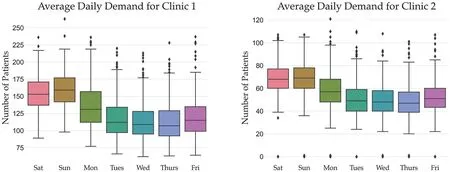
We aggregate the patient demand throughout the year by week across all the years and depict it in Figure 2.The plots show reductions in demand during the school holidays, with peaks during the Influenza season mid-year, as well as during the Christmas/New Year period when the local general practitioners are usually closed.
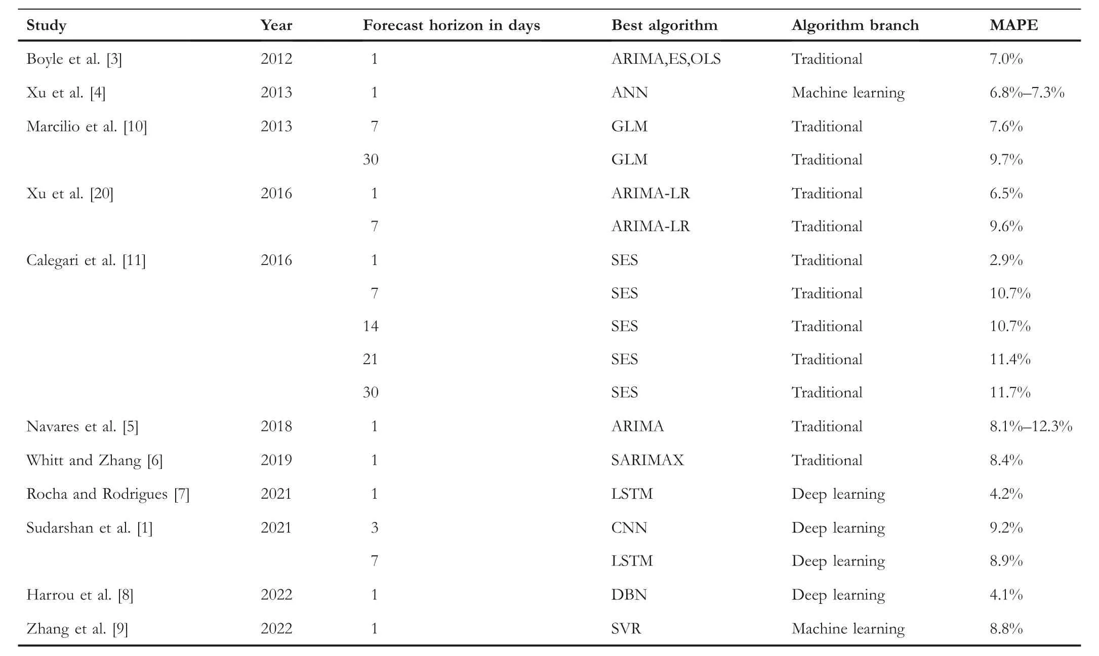
Alternatively,Figure 3 displays the average patient demand for both clinics that is aggregated by the day of the week.It is a common trend across both clinics to see a sharp peak in demand during the weekend when general practitioners do not operate, followed by a gradual decline in the demand that reaches the lowest numbers mid-week.
3.3 | Features
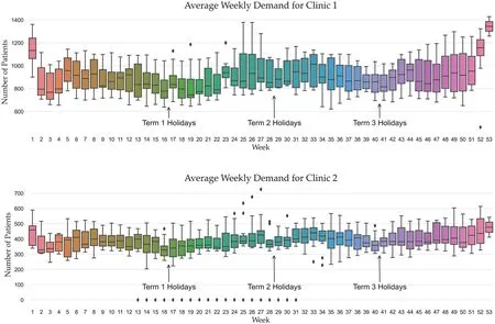
The data in Figures 1, 2, and 3 indicate strong seasonal as well as cyclical weekly auto-correlation patterns.In order to highlight these and to guide the process of selecting suitable lagging values for the features, we relied on auto-correlation(ACF) plots which help identify the relationship between current demand and past values.Figure 4 shows the daily,weekly, and monthly ACF plots for Clinic 1.Seasonal cycles are evident, showing high correlations between patient-flow values from seven to 14 days prior, as well as high correlations between values from the same periods 1–3 years before.
Therefore, feature variables were added representing lagging values from 7,14,364,728,and 1092 days before.Adding the week of the year, the calendar variable accounted for the increasing trend throughout the year and seasonal trends including school holiday patterns.A public holiday flag ensured that the elevated demand on these days was represented as a feature.To accommodate for COVID-19, an indicator was included representing the legally mandated restrictions in place within the region of the clinics,either through the COVID-19 Alert Level system [24] or the subsequent Traffic Light mappings [25] defined by the New Zealand Government.Table 2 lists the names of all the variables used in various figures together with their descriptions.
F I G U R E 3 Average daily patient demand by day of the week across both urgent care clinics (UCCs).
F I G U R E 2 Average patient demand across both urgent care clinics (UCCs) for all years by week number.
F I G U R E 4 Auto-correlation plots (ACF) for Clinic 1.
3.4 | Benchmark models
In order to robustly evaluate the efficacy of the candidate models, we created several benchmark models for comparisons.The first benchmark model approximated the current in-house approach used by the clinics to estimate patient demand.This strategy involved adding a 5% increase to the patient totals from the same period in the previous year.The second benchmark model we refer to as the Naïve model represents a Random Walk method [26], which assumes the forecasted value to be the same as the value from the same period of the previous year.The third benchmark model was generated using ARIMA [27].An additional enhanced version of the Naïve model was also developed, which attempted to generate forecasts for a given day at a point in timetby calculating a mean value of weighted lagst-7,t-14,t-364,t-728, andt-1092 days.
3.5 | Algorithms
We used eight statistical and machine learning algorithms to generate competing models.These included Random Forest(RF) [28], Voting, Stacking [29], Ridge Regression [30], k-Nearest Neighbour Regression (kNN) [31] as implemented in Scikit-learn [32], CatBoost [33], Prophet [34], and an Averaging Model.Table 3 summarises all the algorithms as well as the benchmark models, together with their hyperparameter values where relevant.In addition to the above models, we also attempted to develop a mechanism to adjust and correct the forecasts of the Prophet and CatBoost forecasts.We devised two strategies to model the residuals and to use these assisting models as correctives through exponential smoothing as well as autoregressive techniques.The application of both these approaches to the two underlying models yielded a further four models to the suite of algorithms being explored in the study.
T A B L E 2 Feature names as they appear in figures and their descriptions.
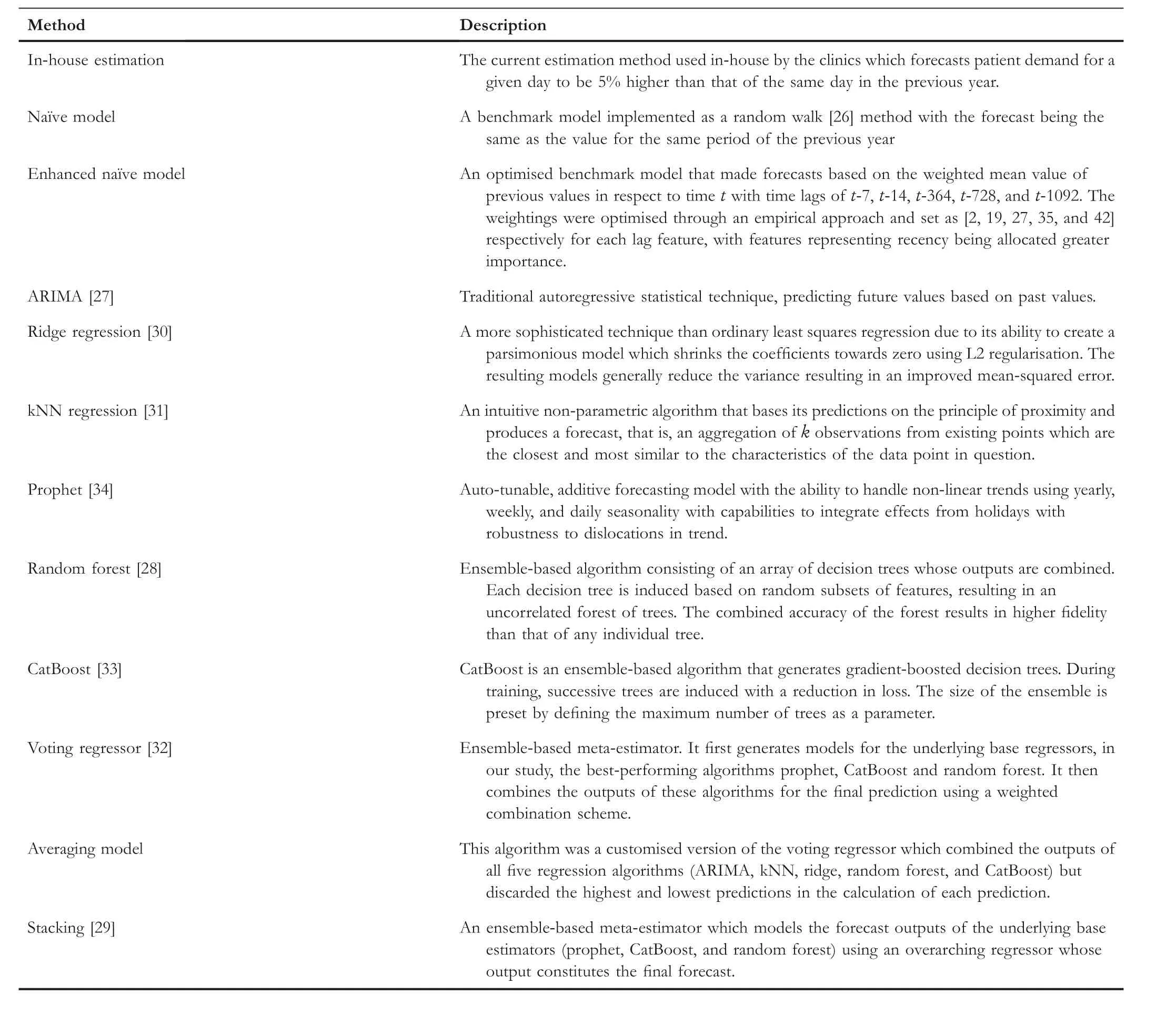
T A B L E 3 Summary of the benchmark models and algorithms used in this study, together with hyperparameter settings where applicable.
3.6 | Hyperparameter tuning
Most algorithms possess numerous hyperparameters,which can be set to a range of values.It is not clear a priori which specific values willyield accuratemodels on different datasets.Therefore,it is a standard practice to employ techniques which exhaustively or randomly select hyperparameter values from a predefined set or range and then train and validate numerous models to determine which hyperparameter combination is most suitable.To determine suitable hyperparameters for the algorithms in this research, we used the grid search method which exhaustively searched through a set of manually predefined values.Hyperparameters are not equally influential across all algorithms in affecting the behaviour of the final models.Table 4 shows which hyperparameters we targeted for tuning each algorithm, as well as what the predefined value ranges were.Unless explicitly stated, default values were used for all other algorithms' hyperparameters.
Hyperparameter tuning was conducted before the models were evaluated against each test dataset.The best hyperparameters were chosen from the training data using the k-fold cross-validation technique.
3.7 | Testing approach
Models were tested on data covering three years from 2017 onwards.An expanding window approach was used for testingthe models.The models were initially trained6The computational time of training each model was less than 3 minutes and the forecast execution time is in the order of several seconds.on data from 2014 to 20167Data before 2014 could not be used for training due to the lagging values which created missing values in the initial few years.and the forecasts were made from 1 January 2017 up to 13 weeks ahead(91 days).Figure 5 visually depicts our train/test approach.

T A B L E 4 Hyperparameter values for each algorithm used in the grid search optimisation approach.
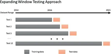
F I G U R E 5 The expanding window testing approach used in this study.Each testing window represents 13 weeks, equivalent to 91-days ahead or one quarter.
In generating the forecasts for each quarter, the forecasted values eventually became the inputs for subsequent forecasts.This was the case with 7-day and 14-day lag variables, which after the first and second week of the forecasts respectively, no longer had access to actual observed values in the dataset but instead had to be replaced with forecasted values to mimic the real-world scenario when having to forecast into the future.
Following the prediction of the values for the one quarter ahead,the training window would then be expanded to include the actuals from the next quarter, and the 91-day forecast horizon would then shift so that the patient demand values would be predicted for the subsequent quarter.By continuously repeating this forecasting process until the end of 2019,12 forecast periods were generated, each containing daily forecasts for a 91-day period.
Forecasts were not made for the 2020 data due to the disruption caused by the pandemic and lockdown mandates which resulted in the forced closures of some clinics for extended periods; however, data from 2020 was used for training8If a clinic was closed during 2020,then the missing values were imputed using data from the same period in 2019.This is similar to the approach used by the in-house forecasting strategy.the models to learn patterns generated by the pandemic, and these models were used to predict 2021 data.Therefore,given these COVID-19 disruptions,we present and analyse the model forecasts separately for the years 2017–2019 describing stable patterns and for 2021, representing the volatile pandemic period.
3.8 | Model evaluation
We used several evaluation metrics to assess the efficacy of the models as each one provides a slightly different perspective.We applied each of these metrics separately on the 2017–2019 and 2021 datasets.
We report the MAPE values for each algorithm.The calculation of MAPE is as follows:
whereTis the number of forecasts under evaluation, and︿yt-ytis the error or residual term arising from the difference between the observedyvalue and the forecast value︿ytat time pointt.MAPE is a useful measure because it can express deviations between the observation and the forecasted values in terms of percentages, and as such, it is easy to interpret.MAPE is frequently used in literature and is recommended as the primary evaluation metric for forecasts [35].Since it is scale-independent, MAPE can be used to compare forecasts across datasets with different ranges of values for the dependent variable–as is the case in this study with respect to Clinic 1 and Clinic 2 patient volumes,but it also enables comparisons between different studies which we also conduct.
We used the Root Mean Square Error (RMSE) defined below as our key evaluation metric:
RMSE is informative as it describes the spread of the errors while being scaled to the dependent variable, with a smaller RMSE being preferred.
In order to summarise the performance of all the algorithms across all the forecast test datasets, we used the mean ranks calculation.For each forecast period (91 days), every algorithm was ranked from 1 to 12 concerning its MAPE value—the best performing algorithm achieving a rank of one.This was performed across all 12 testing periods, and the mean ranking was calculated.
For completeness,we also report the Mean Absolute Error for all models, which in conjunction with the previous two metrics is also used by Zhang et al.[9].MAE is the average absolute difference between the observation and the forecasted values.As such, it is somewhat conceptually simpler to interpret and is less sensitive to large errors like RMSE due to the squaring of the differences.Therefore,several significant errors will influence RMSE to a larger extent than MAE.The calculation for MAE is
Using the above analyses alone can determine differences in accuracies between the models, but it cannot determine if the forecasts between various models are statistically different.To determine this,we use the Diebold–Mariano[36]statistical test to establish whether sequences of forecasts of the models are meaningfully different from one another using pairwise comparisons.We compare the outputs of competing models with those of the in-house benchmark estimation models.We also conduct pairwise comparisons between the bestperforming models.
3.9 | Model interpretability
The increase in predictive strength and complexity of modern machine learning algorithms has been accompanied by an associated reduction in the interpretability of the induced models as well as in their ability to explain their outputs.This has become a concern due to growing regulatory and general policy requirements that greater transparency is realised within predictive modelling [37].
The necessity to address this problem has been taken up by the emerging field of XAI.A suite of tools has recently become available that tackle this challenge and attempt to answer the“why”behind the machine learning models'predictions.There are two techniques which are currently recognised as being state of the art in the field of XAI[38],namely,LIME[39]and SHAP [40].We use both of these tools in this study.
We employ these techniques to evaluate the behavioural mechanics of the predictive models at both theglobalandlocallevels.At a global level, we are interested in the overall aggregate effects that each feature/variable has on the model outputs.For this, we rely on feature importance plots which rank as well as depict the relative impacts of each feature.We also consider feature importance visualisations,which have the ability to depict the effect of changing feature values on the final forecast.These plots together offer a degree ofhigh-levelinterpretability of the key drivers for a given model.When we consider model behaviour at a local level, we are seeking an explanation from a model in terms of why exactly it has arrived at a given forecast for a specific data point.
Both SHAP and LIME generate new models which approximate the predictions and the behaviour of the underlying “black-box” models.These new models are calledsurrogate modelsand are designed to be interpretable.Since the surrogate models are trained to closely emulate the mechanics of the actual models, we can therefore extract insights about the actual models by interpreting the surrogates.Surrogate models learn how to emulate the actual models by perturbing the input data similarly to sensitivity testing, thereupon observing the responses to the final model forecasts.In this way,surrogates effectively model the responses in the forecasts based on the adjustments to the input data.This principle enables us to understand the magnitude of impacts and the importances of the features, that is, if we observe a large response in the forecasts in response to a small perturbation in a given feature,then we can deduce that the given feature is an important overall predictor.
SHAP (an abbreviation for SHapley Additive exPlanation)is based on Shapley values [41] which draw from game theory literature to attribute each feature's marginal contribution to the final predictive outcome in collaboration with the other features.In this way,SHAP can both generateglobalandlocalexplainability.LIME on the other hand operates only on thelocallevel.It generates an interpretable model from a candidate of underlying algorithms like Linear Regression,Lasso,or Decision Trees, using weighted sample data points that are similar to the target observation for which an explanation is sought.
The tools are not perfect and have some shortcomings.Despite its strong theoretical underpinnings,the computational complexity of Shapley values grows exponentially in the number of features, and their exact calculation is in fact intractable as feature sets expand; therefore, approximation heuristics are used.Another limitation of SHAP is that it can sometimes generate unrealistic input data for creating the surrogate model which compromises the quality of the insights.LIME on the other hand requires a trial-and-error process with a range of different tunable parameters to generate a surrogate model that makes sense.Additionally, it suffers from an instability issue whereby explanations for proximal data points may be significantly divergent [42].For these reasons and the difference in perspectives that both approaches have,it is more robust to use both techniques in tandem when analysing the interpretability of any model.
4 | RESULTS
4.1 | Performance comparisons
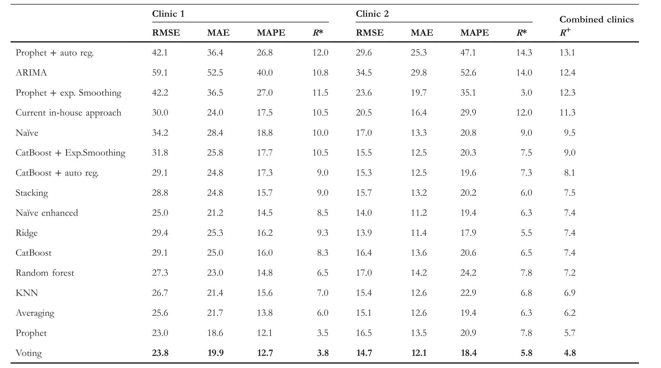
Table 5 shows the average RMSE,MAE, and MAPE together with the mean rankings across the 12 forecasts made between 2017 and 2019 for each model.The top four performing models with the lowest mean rankings (i.e., best ranked) with respect to MAPE are emphasised in bold.For Clinic 1,the best models are Voting, Averaging, Stacking, and Prophet.The patterns were similar for Clinic 2,with Stacking generating the lowest error rates.The results indicate that error correction mechanisms for adjusting model predictions using AutoRegressive and Exponential Smoothing models were effective at producing improved accuracies over the benchmark approaches; however, they were not competitive with the best models overall.All proposed models produced a clear improvement over the current in-house forecasting strategies,as well as most of the benchmarking approaches for the 2017–2019 dataset.An example of the forecasting behaviour of the Voting model on Clinic 1 data for all four quarters in 2019 can be seen in Figure 6, contrasted against the actual patient flow values.
While Table 5 indicates that the proposed models perform more accurately than the benchmark models across different metrics, we performed additional analyses to determine if the forecasts from the best-performing algorithms are indeed significantly different at an appropriate statistical level from the forecasts of the current in-house forecasting methods used at the clinics.For this, we relied on the Diebold–Mariano test.The results indicated that the 12 forecasts across 2017 to 2019 for each proposed model were significantly different (at the 0.01 level) to the in-house forecasting.
Additionally, we conducted a pairwise Diebold–Mariano test between the forecasts of the best-performing models.We found that for the Clinic 1 forecasts,most model forecasts are significantly different (at the 0.05 level) from one another except for Stacking,Averaging,and Prophet.For Clinic 2,most forecast pairings can be considered significantly different to each other, except CatBoost versus Random Forest, Votingversus Prophet, and Averaging versus Stacking, Voting and Prophet.

T A B L E 5 Model forecast accuracies on 2017–2019 data.[R]denoting mean ranks,[*]mean ranking per clinic, and[+]the combined mean ranking over both clinics, which is used to order all the results—the best performing algorithms appearing at the bottom and are in bold.
We now analyse the forecasting characteristics of the proposed models on the 2021 dataset representing turbulent and unstable patterns brought on by the pandemic operating conditions.We first examine the aggregate behaviour of the models on this time range across multiple metrics as seen in Table 6.The results again confirm that across both clinics, on average the Voting algorithm has produced the best generalisability according to MAPE,while the Prophet and the Averaging model were second and third respectively.In terms of the differences in the accuracies of the models between the two clinics, MAPE values indicate that achieving accurate forecasts for 2021 was considerably more difficult for Clinic 2 than for Clinic 1.MAPE indicates that the errors for Clinic 2 were approximately 50%higher than that of Clinic 1.We can infer from this that Clinic 2 has been more susceptible to pandemic disruptions than Clinic 1 and the volatility in the actual data that supports this claim can also be verified in Figure 1.

F I G U R E 6 Example forecast plot for 2019 showing actuals versus forecasted values for Clinic 1 by the voting model.
T A B L E 6 Model forecast accuracies for 2021.[R]denoting mean ranks,[*]mean ranking per clinic,and[+]the mean ranking over both clinics,which is used to order all the results – the best-performing algorithms appearing at the bottom and are in bold.

F I G U R E 7 Example forecast plot for 2021 showing actuals versus forecasted values for Clinic 1.
Table 7 unpacks the individual quarterly forecasts for 2021 and displays them with respect to MAPE.It is observable in this table that predictions for the fourth quarter were problematic across both clinics.The third quarter also posed challenges for Clinic 2.It is therefore revealing to inspect an example of the actual forecasts from the Voting model across the whole of 2021,as can be seen in Figure 7 for Clinic 1.The figure clearly shows that the model forecasts significantly diverged from the actual observations in the fourth quarter.It should be re-emphasised that the models predict one quarter ahead, and due to this, are not able to take into account changes in the operating environment which might take place after the forecasts have been made.In the case of the fourth quarter forecasts for Clinic 1, these coincided with the initial outbreak of the SARS-CoV-2 Delta variant in the Auckland region in the previous quarter.This was followed by an unprecedented decision by the majority of local general practitioners to cease seeing patients, offering only virtual consultations.The closure of the primary care providers to inperson consultations continued into the fourth quarter despite a relaxation in the COVID-19 Alert Level, whereupon both factors translated to a surge in patient demand at the UCC.This scenario is an example of the difficulty of making predictions with very large forecasting horizons, especially under volatile and novel circumstances.
Table 8 summarises the accuracy of the best-performing proposed models with respect to the mean percentage improvement they achieved over the forecasts made by the inhouse estimation methods.The table indicates that Voting was the best-performing approach across both clinics.Voting improved the accuracy by 28% over the in-house method for the 2017–2019 data and by 16%for the 2021 data for Clinic 1.Meanwhile, the improvements over the in-house approaches ranged for Clinic 2 between 25% for the 2017–2019 data and 30% for 2021 data.

T A B L E 8 Model improvements over the current in-house benchmark model for data ranging 2017–2019 and 2021.
4.2 | Forecast stability
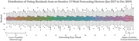
F I G U R E 8 Forecast stability as an aggregate across all the 13-week forecast horizons for Clinic 1.
Earlier analysis has demonstrated some of the difficulties in making long-range forecasts.In Figure 8,we graphically depict an example of the overall variability in the forecast errors of the Voting model over a 91-day forecasting period.The figure represents the average residual/error of the forecasts by the number of days ahead,across all the forecasts generated by the model.The figure shows notable stability of the errors for much of the 91-day forecast horizon.Unsurprisingly,the error rates and overall stability is the greatest in the first few weeks due to the forecasts utilising actual 7- and 14-day lag data.However,around the 85-day mark,some increase in variability can be detected, which may indicate that the forecast deterioration begins to take place at this point.
4.3 | Model interpretability
We now use SHAP and LIME tools to extract the Voting model's interpretability and forecast explainability insights.Additionally, we provide feature importance graphs from the perspective of CatBoost and Random Forest models separately since they are constituent parts of the Voting model which aggregates them as well as the Prophet model.
We highlight several diverse forecasting horizons as examples of model behaviour.For this, we use the Voting model's behaviour on forecasting values for Q2 2018 and Q4 2019, which represent relatively stable data patterns.We contrast the model behaviour from these stable periods with the model behaviour for forecasting Q1 2021, which encompassed a highly disruptive period due to the pandemic lockdowns.We then focus specifically on examining the model behaviour on forecasting demand for atypical scenarios such as holidays which are known to strongly affect patient presentation volumes–for this, we analyse model explainability for forecasting Easter and school holiday patient flows, while examining the magnitude of the impact of the various features.
4.3.1 | 2018 Quarter 2 forecast horizon

F I G U R E 9 Variable importance plots Q2 2018 showing outputs from(a) CatBoost, (b) Random Forest (RF) and (c) SHAP.
Figure 9 represents forecasts in Q2 2018.It depicts the interpretability of the model through several perspectives and is an example of model analysis at agloballevel.Figures 9a and 9b show the feature importance plots as determined by the actual models themselves, CatBoost and Random Forest9Random Forest uses the mean decrease in impurity(Gini Importance)for estimating the feature importances.respectively—ranking features from most to least impactful as well as depicting the relative magnitude of effect that each feature exerts.Meanwhile, Figure 9c shows both the feature importance plots and the model's forecast effects in response to changing values of each of the features.However, the outputs of Figure 9c are generated by the SHAP surrogate model.Each technique offers a slightly different perspective;however,collectively,they act as a means of triangulation and thus offer more reliable insights and a more robust foundation for drawing conclusions.
The figure shows that there is an agreement from all three perspectives that the most important features influencing the forecast of patient demand during this period are values from the same day from 1 year, 1 week as well as 2 weeks prior.We can conclude that long-term trends (values from the previous year) are more important drivers of predictions than recency (values from one and 2 weeks prior)under the prevailing conditions for this time period.The Random Forest model places heavy weighting on the oneyear lag feature compared to CatBoost, with CatBoost tending to agree more with SHAP.The values from two and 3 years prior are the next most important features with the order of importance differing slightly across the three perspectives.Week of the year and the public holiday flag values are seen as the next most important by CatBoost and Random Forest, with SHAP agreeing with the reverse order of importance.All models thus view the COVID-19 Alert Level as being insignificant, which is expected given that the data represents the pre-pandemic period.
The SHAP summary plot in Figure 9c offers an additional dimension with respect to global interpretability.In this figure, we can see how an increase/decrease in the values of each feature directly impacts the final forecast.In the figure,the colours represent feature values, where red is high and blue is low values.Thex-axis represents SHAP values.Data points with a positive SHAP value (appearing to the right of the vertical zero line) have a positive impact on the forecast value, in other words, they contribute towards predicting a higher patient flow.Those points having a negative SHAP value (to the left of the vertical zero line) have a negative impact and decrease the forecasted patient flow.The further the points extend from the zero vertical line, the larger the contribution and the magnitude of effect that they bear on the final forecast.
From Figure 9c, we can observe that higher values of the top two features have a greater effect on the final forecast than the lower values of these features.In other words, the model responds more strongly to forecasting higher patient demand if the values for the previous year or previous week were high, then it would predict a lower patient flow if the values for those features were low.The directionality of the impact of these features is stronger towards higher forecasts.The effect of the next three features, 14-day, 3-year, and 2-year lags, is more balanced.The values for the public holiday feature are binary.We see that days which are not public holidays result in a relatively modest reduction of forecasted patient demand.However, there are two data points (the third is overlapping) that represent public holidays (Easter Monday, Queen's Birthday, and ANZAC Day) which demonstrate how significantly the model reacts to increasing the forecast demand on those days.Lastly, the week number generally causes a decrease in forecast demand.We see that as the second quarter progresses and autumn months approach winter and the Influenza season, the week number feature begins to affect the final forecasted demand towards higher values.
4.3.2 | 2019 Quarter 4 forecast horizon
We conduct model interpretability analysis on data from the forecast of Q4 2019, representing the final period before the pandemic, as seen in Figure 10.We intentionally selected another non-pandemic period to demonstrate the reproducibility of the previous results and thus the robustness of this analysis method.We show here that the model mechanics indeed mirror the behaviour of the models seen in Q2 2018 analysed above.
It can be seen in Figures 10a,b that there is broad agreement amongst the two models about feature importances with those from Quarter 2 of 2018.The SHAP Figure 10c offers a slightly different interpretation though.We notice that the lagging values from two years prior have become more important for fourth-quarter predictions.This makes intuitive sense because the fourth quarter experiences a steady surge in demand, especially in December of each year.Therefore, it is logical that as the uptick in demand begins to take place,values from the previous years will be more informative and relied on by the models for making forecasts than the values from one or two weeks prior.Similarly,we also see that the week number has a stronger effect on predicting a higher demand as the week numbers increase, which is consistent with the previous observation—this is however accentuated over the fourth quarter as the year approaches the end due to the local general practitioners closing over the extended holiday season.Once again, the figure testifies to the strong effect that public holidays have on the final forecasts.There are three data points in this quarter flagged as public holidays(Labour Day,Christmas Day,and Boxing Day)which significantly impact driving up the forecasted demand for those days.

F I G U R E 1 0 Variable importance plots for Q4 2019 showing outputs from (a) CatBoost, (b) Random Forest (RF) and (c) SHAP.
The consistency between the model behaviour on the Q4 2019 and Q2 2018 forecasting horizons is representative of feature importance plots from other forecasting horizons drawn from the stable non-pandemic scenarios (2017–2019).We can therefore conclude that during typical operating conditions, the most impactful features are the demand from the previous year for a given day which provides stability to the forecasts, together with the demand from 7 to 14 days prior,which capture some fluctuation patterns and provide responsiveness to dynamic operating conditions as they are evolving—such as seasonal outbreaks of Influenza or other large outbreaks of respiratory illnesses which have a stochastic component to them.
4.3.3 | 2021 Quarter 1 forecast horizon
We now contrast the model behaviour from pre-pandemic periods with an example from Q1 2021 whose data substantially deviate from the usual patterns due to the underlying pandemic conditions (refer to Figure 1).Therefore, this forecasting horizon represents a case in point for the role that different features play in the adaptability of the model and the adjusting of the forecasts during this atypical period.Figure 11 depicts the model mechanics.

F I G U R E 1 1 Variable importance plots for Q1 2021 showing outputs from (a) CatBoost, (b) Random Forest (RF) and (c) SHAP.
We can see a consistency between the feature rankings between the CatBoost (Figure 11a) and Random Forest(Figure 11b) models, as well as a general agreement between them and SHAP (Figure 11c) on the top two features.We observe now that recency expressed as lagging values from the previous seven days has become the most important driver of forecasted values rather than the more erratic COVID-19 2020 demand values from one year prior.This is in contrast to prepandemic forecast periods where the most important feature was the demand from 1 year ago, thus indicating that the expectations of stability were held by the prior models.We can also see especially in the case of the SHAP importance graph that the COVID-19 Alert Level has become a significant contributor to the final predictions in this period,unlike in the pre-pandemic data.From the SHAP summary plot, it can be seen how higher COVID-19 Alert Level values have a larger impact on reducing the predicted demand, with low values having little impact.This behaviour is expected, as average COVID-19 Alert Level 4 days witnessed a considerable reduction in patients compared to COVID-19 Alert Level 1 days.
4.3.4 | COVID-19 alert level model behaviour
Here,we switch from aglobalto alocalanalysis of the model behaviour.We continue with examining data from the Q1 2021 period and demonstrate more precisely the effects that the COVID-19 Alert Level values have on final forecasts.We leverage the model explainability capability of the XAI tools to expose how the model reasons its forecasts on individual data points.We probe the forecasting behaviour of the models on two specific days with differing operating conditions—one forecast for a day representing a COVID-19 Alert Level 1 status and another having a COVID-19 Alert Level 3 status.Figures 12 and 13 depict the different scenarios.
Figure 12a depicts the CatBoost model behaviour through the lens of SHAP's force plot, while Figure 12b exposes the Random Forest model behaviour through the lens of LIME—both tools provide model explainability of the forecasts on an Alert Level 1 day that took place on Tuesday 9 February 2021.In Figure 12a, thebase value(134 patients) represents a mean forecast across all the observations in the dataset—this is a default forecast assuming all things being equal.We see in bold the actual forecast (149 patients vs.the observed 181) made based on the given feature values.The plot reveals the dynamic of how different features and their values compete in order toforcethe final predictions above (red bars) the base forecast and alternatively the feature/values combinations that have the opposing effect(blue bars).Figure 12a indicates that 7-and 14-day lagging features have the strongest effects onforcingthe final forecast upwards on this specific day.The length of the bars represents the magnitude of the effect.A small negative forcing effect can be seen from the lagging values from one year prior as well as the week number.
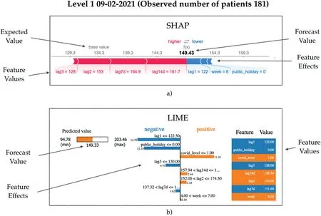
F I G U R E 1 2 Model explainability showing the reasoning behind a forecast during COVID-19 Alert Level 1 2021 using (a) SHAP and (b) LIME.
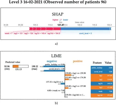
F I G U R E 1 3 Model explainability showing the reasoning behind a forecast during COVID-19 Level 3 2021 using (a) SHAP and (b) LIME.
Figure 12b gives LIME's perspective.The final model prediction(predicted value in the left panel)is 149 as well.The middle panel explains the surrogate rule-based model with both the conditions and the coefficients(magnitudes of effect)that LIME has induced in order to mimic the underlying Random Forest model.Features are ordered from top to bottom with respect to their effect size.We see that the lagging value from one year prior and the fact that the day was not a public holiday have the strongest influence on pushing down the forecast value from the theoretical maximum of 203 patients (left panel).Meanwhile, the fact that the prevailing COVID-19 Alert Level was low for this day(1),the effect this has on the model is to push the forecast up from the theoretical minimum of 95 patients.
Exactly one week later, Auckland was in COVID-19 Alert Level 3.Figure 13 shows SHAP and LIME model reasoning for this day.The actual observation for the day was 96 patient arrivals.We see in Figure 13a that the overarching variable forcing down the forecast is the increased COVID-19 Alert Level value.However, we see that the 7- and 14-day lagging features (expressing patient numbers from COVID-19 Alert Level 1)were forcing the forecast upwards,eventually arriving at 121 patients.In Figure 13b, we see that the public holiday and the COVID-19 Alert Level had the strongest model output effects towards smaller forecast values, but in contrast to SHAP, we see that the 1- and 2-year lagging values were pushing in the direction of higher forecasts.From both perspectives, it is evident that the models strongly react to the COVID-19 Alert Level feature, and we gain an insight into how the remaining features positively and negatively contribute to realising accurate forecasts.
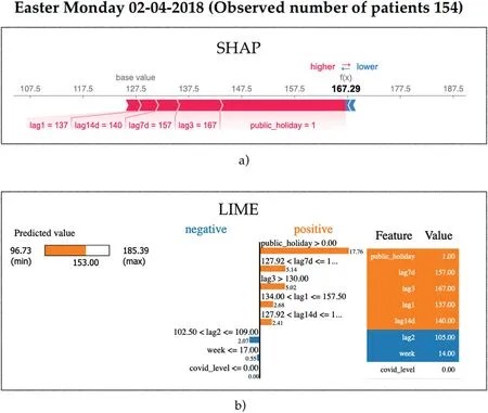
4.3.5 | Easter Monday model behaviour
Here we highlight the effectiveness of the public holiday feature to impact forecast results.We use Easter Monday (02-04-2018) to illustrate this scenario.The actual observed demand on this day was 154 patients.From SHAP's perspective,Figure 14a shows indeed that the model strongly reacts to the fact that this day is a public holiday, forcing upwards the final forecast towards 167,together with smaller contributions from the 3-year and 7-day lagging values.Negligible forcing effects towards smaller forecasts can be seen for this day from the remaining features.
The final forecast that LIME attempts to explain in Figure 14b is 153, being very close to the actual observation.LIME's explanation of the model behaviour is in agreement with that of SHAP.The figure shows that flagging the day as a public holiday has the largest impact on increasing the prediction.Similarly to SHAP,both the 7-day and the 3-year prior features also impact on increasing the forecast.
The results from the figure clearly indicate the utility and effectiveness of the public holiday feature in its ability to adjust forecasts correctly and ultimately lead to more accurate forecasts.
4.3.6 | School holidays model behaviour
Finally, we repeat our analysis approach and illustrate the model behaviour on days falling during school holidays.We know from domain experts that school holidays have an effect on patient presentation volumes at both clinics, with the effect tending to decrease overall presentations.Efforts were made to devise a dedicated feature that captures school holidays; however, we found that combinations of lagging values were sufficient for expressing this information to the models.We highlight an example of model behaviour on a school holiday drawn from Friday 04-10-2019.The model's forecast reasoning for this day can be seen in Figure 15.
SHAP's reasoning in Figure 15 shows us that the default forecast value is 133 patients, with the actual observations being 119.We see that the strongest effects arise from a coalition of features:7-day and 3-year lagging values,together with the week number which all effectively force the forecast towards the final value of 118 patients.
F I G U R E 1 4 Model explainability showing the reasoning behind a forecast on Easter Monday 2018 using (a) SHAP and (b) LIME.
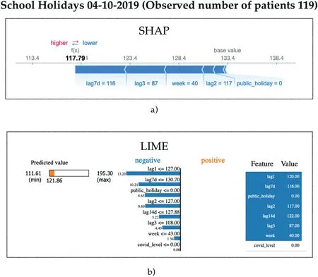
F I G U R E 1 5 Model explainability showing the reasoning behind a forecast during school holidays in 2019 using (a) SHAP and (b) LIME.
Likewise,we see similar dynamics taking place from LIME,where the 1 and 2-year as well as 7-day lagging values,together with the public holiday flag, all push the forecasted value downwards towards 122 patients.We therefore conclude that the evidence demonstrates that lag features in tandem with other features naturally capture the onset of school holidays and can provide the models with sufficient information that enables them to adequately adjust forecasts towards lower patient flows without the need for engineering an extra variable and thus risk model overfitting.
5 | DISCUSSION
In response to RQ1, our research conclusively indicates that it is indeed possible to leverage machine learning algorithms to generate patient demand forecasts at UCCs which significantly improve on existing in-house and benchmark strategies.It has been demonstrated that the forecast accuracy of the best models improved between 25% and 28% over the in-house strategies during the pre-pandemic periods.Following the outbreak of the COVID-19 pandemic in New Zealand, and the unpredictability of constraints placed on residents, resulting model errors were moderately exacerbated.However, the generated forecasts still displayed a considerable improvement over the in-house models, as well as over the competing benchmarking approaches.Over this period, the proposed model improvements over the in-house strategies ranged between 16% and 30% across both clinics.The requirement of the models to generate reliable forecasts 3 months ahead is demanding since there are many unaccounted factors which can occur after the forecast is made,and these factors can heavily influence eventual demand.This was witnessed in predicting Q4 of 2021 when the local primary care providers closed their practices to in-person consultations in response to the initial outbreak of the SARS-CoV-2 Delta variant.The side effects eventually resulted in a surge in demand at the UCCs.Naturally,these factors and their knock-on effects cannot be captured at the point in time of generating a longterm forecast, but all things being equal, the best-performing models exhibited notable reliability even as the forecasts extended out towards the most distant forecast horizon.
The accuracy of the long-term forecasts presented in this study also needs to be contextualised within the body of literature as seen in Table 1.Literature reports accuracies ranging from approximately 3%–12% MAPE for one-day ahead forecasting.Meanwhile, the limited evidence for 30-day ahead forecasting accuracy ranges from approximately 10%–12%MAPE.Our 91-day ahead forecasting accuracy over the pre-pandemic period ranges from approximately 9%–13%,with 13%–18% MAPE for the pandemic period.The results indicate a remarkable competitiveness of our approaches with those reported in literature taking into consideration both the long-term forecasting horizon of our models and the unstable pandemic data used in this study.
A broad range of machine learning algorithms were explored in this study.Literature regards ensemble-based methods as the state-of-the-art for solving many real-world machine learning problems, and testifies to numerous advantages of using ensembles over single-model approaches[43].It is therefore perhaps unsurprising that our study has also confirmed much of the experiences in the existing literature.Thus,in answering RQ2,we find that the Voting algorithm has on average demonstrated better generalisability properties over the other algorithms for this particular setting.The base estimators which constitute the Voting model were chosen both on the merits of their individual performances and also on the basis that they were sufficiently diverse from one another,which is a cornerstone principle of effective ensemble-based modelling.
Not only is producing reliable forecasts 3 months ahead demanding due to compounding errors when forecasts become inputs to subsequent forecasts, as well as numerous unforeseen factors which can affect long-term patient demand,but it is also difficult concerning the limitations it places on the types of features that can be used for making long-term predictions.The reviewed literature indicates that numerous proxy variables capturing data on current weather, temperature,traffic,Internet search terms on medical ailments and even flutracker data hold the potential for accurately estimating shortterm patient demand in UCCs.However, while these proxy variables for predicting demand are often indicative of immanent patient presentations, their ability to be used for predicting patient presentations 1 month, 2 months, or 3 months ahead is tenuous.Therefore,in practice,a fairly limited number of variables can be used with machine learning for making long-term forecasts in this problem domain.Given this constraint, models generated in this study predominately used lag values and flags for public holidays and COVID-19 Alert Levels to provide information to the algorithms and proved to be sufficient.
In addressing RQ3, we found that during stable (non-COVID-19) periods, the most useful features were lag values of actual patient demand from 1 year prior, followed by lag values from 1 week prior.However, this changed when forecasts were made for COVID-19 periods which were accompanied by various lockdown mandates.During these periods, we found that lag values of one week prior became the most impactful, followed by the lag values of one year before, as well as the variable indicating the current COVID-19 Alert Level.It is interesting to note that hospital EDs experienced unprecedented declines in patient volumes during the pandemic crisis [16].Given the findings from this study, forecasting models specifically for EDs could in future therefore also benefit from integrating variables, which capture COVID-19 or other pandemic alert levels to produce more accurate estimates.
To improve the models further during the current COVID-19 pandemic, but also in the context of new future pandemics, we also hypothesise that the models would benefit from an additional feature which expresses the approximate proportion of general practitioners' surgeries which would not be operating on a face-to-face basis.We observed the unforeseen effects of this scenario in the Q4 2021 data, and we believe that the forecasting models can adjust to them more optimally if furnished with an additional feature that captures the operating status of local primary care providers.This remains future work, together with experimenting with deep learning models and a creation of short-term weekly forecasting models that operate on more real-time data describing weather, traffic and Internet search terms, and which have the ability to raise alerts if immanent surges in patient demand can be expected.
5.1 | Practical implications of findings
The results of this work demonstrate the potential of an ensemble of machine learning algorithms to accurately forecast patient demand at UCCs and EDs up to one quarter ahead while also achieving transparency into their mechanics when combined with XAI tools to build trust from the end users.By improving the accuracy of patient demand forecasting, this research has important implications for healthcare providers,as it can assist in optimising resource allocation,reducing wait times, and improving patient outcomes.
In light of the above-mentioned findings and discussion,it should be highlighted that our research holds applicability beyond the healthcare domain.The machine learning solutions we have demonstrated to be effective for patient demand forecasting at UCCs can be adapted for other domains that require accurate long-term forecasting.Examples of these domains include retail, transportation, and logistics, where accurate demand forecasting is crucial for optimising resources and operational efficiency.The effectiveness of our proposed methods,even in the face of unpredictable circumstances such as the COVID-19 pandemic, further showcases their robustness and adaptability.The general principles and methods employed in this study can be customised to suit other industries, enabling stakeholders to benefit from improved forecasting capabilities.As a result,our research holds value for a wider audience, inspiring cross-disciplinary applications, and contributing to advancements in forecasting methodologies across various fields.
5.2 | Study limitations and future work
Though our study presents promising results, we acknowledge limitations and opportunities for future research.One limitation is the external validity, as data were predominantly collected from two clinics within a specific region.To enhance the generalisability of our findings, future studies should expand the scope to include clinics from various regions and healthcare systems.Despite the best efforts of the researchers to clean the dataset, there is a possibility that data entry errors occurred in the dataset and were undetected,resulting in some duplicate and miscategorised entries.Also,the dataset was insufficient in supporting the modelling of patient arrivals at an hourly granularity which would have been considerably more suitable to support the management of human resources.
As the healthcare landscape evolves, particularly amid ongoing and future pandemics and other potential disruptions, it is worthwhile to consider incorporating other variables (including pandemic-related variables) into the models, which may improve responsiveness to demand fluctuations due to public health measures or emerging virus strains which this study did not explore.Additionally, researchers might explore advanced machine learning techniques, such as deep learning and reinforcement learning, to bolster model performance.By refining our models and utilising new data sources, it may be possible to develop more precise and adaptable demand forecasting tools for the everchanging healthcare environment.
Also, our models primarily focussed on long-term forecasting, and as such, limit their capacity to capture short-term variations.Therefore, integrating real-time data sources could enable more dynamic and adaptive models for both short-and long-term forecasting needs.Work on developing short-term and highly responsive models using a rich set of real-time proxy features is the subject of future work.
6 | CONCLUSION
The ability to accurately forecast patient flows in UCCs and EDs is becoming increasingly expected so that an efficient allocation of human resources can be realised to prevent congestion, and deliver consistently high-quality medical care.
Forecasting patient flow is however a challenging undertaking with many latent factors ultimately affecting patient presentation volumes.The problem becomes even more difficult for long-term forecasts which are necessary for resource management.
Up to now, research efforts to develop forecasting models for this problem domain have predominantly involved shortterm forecasts using traditional statistical methods.There has recently been a growth of interest in predicting patient flows at EDs, and increasingly, machine learning solutions are beginning to emerge in the literature.
This study makes a unique contribution by exploring the feasibility of a suite of machine learning models to generate accurate forecasts of up to 3 months ahead for two large UCC clinics.This research also considered datasets that covered both the pre-COVID-19 and the pandemic periods and investigated in detail which features are the key drivers behind the forecasts under both operating conditions.
Our research determined that ensemble-based methods produced the most accurate results on average for this setting and were competitive with accuracies in prior studies.We found that the most impactful features during the prepandemic periods were patient flows from the same periods in previous years, while features describing the prevailing COVID-19 Alert Levels together with the patient flow values from more recent time-frames were more effective at generating accurate forecasts during the pandemic periods.
A distinguishing feature of this study is the novel use of emerging tools from the field of eXplainable AI in our methodology, which has enabled us to demonstrate the inner mechanisms and the behaviours of the underlying machine learning models, which would otherwise be opaque.
ACKNOWLEDGEMENTS
The authors would like to thank ShoreCare and their staff for both their ongoing assistance in working with the data and provisioning the datasets and for ultimately enabling this research to take place.
CONFLICT OF INTEREST STATEMENT
The authors declare no conflicts of interest.
DATA AVAILABILITY STATEMENTEmbargo on data due to commercial restrictions.
ORCID
Teo Susnjakhttps://orcid.org/0000-0001-9416-1435
Paula Maddiganhttps://orcid.org/0000-0002-5962-4403
杂志排行

CAAI Transactions on Intelligence Technology的其它文章
- Fault diagnosis of rolling bearings with noise signal based on modified kernel principal component analysis and DC-ResNet
- Short‐time wind speed prediction based on Legendre multi‐wavelet neural network
- Iteration dependent interval based open‐closed‐loop iterative learning control for time varying systems with vector relative degree
- Thermoelectric energy harvesting for internet of things devices using machine learning: A review
- An embedded vertical‐federated feature selection algorithm based on particle swarm optimisation
- An activated variable parameter gradient-based neural network for time-variant constrained quadratic programming and its applications